


I knew I was neglecting somewhere:


I knew I was neglecting somewhere:
I've already posted the next page in a previous post, so not much point in doing so again.
Anywayz, this is to be the last image from my D&Dc fan-Manga that I will display here(or anywhere else for that matter), in wallpaper form:

Right, well, this is the next page to my Totally Spies fan-comic. *Warning* Contains the 'F' word:
Hope you like
Not posted for several weeks?? Oops! I'll try to do better!!
Though for now, another pic, again another contest entry... a follow-up to my previous beach scene featuring the Totally Spies girls and I did learn from my mistake of last time, with not positioning the characters in a weird place on my paper so I run out of space!
So then, here it is, 'Totally Beach Spies - Second Day'.... WARNING, contains tasteful semi-nudity:


What the fuck is going on with that middle girl's hand?
Look how big it is compared to the Redhead's hands. It's in the background, yet it's about twice as large. I know you were trying to go for a foreshortening thing here, but that's not right at all.
The other two girls look like poseable dolls sitting there in the background. Totally unnatural and weird, especially since the way your D&D comics seem to have avoided this problem.
<@Terra> he told me this, "man actually meeting terra is so fucking big", and he started crying. Then he bought me hot dogs
Heh, it's only a little bit too big, but I didn't have enough time to go and alter it so I decided, what-the-hell. Also in regards to the other two, they're just supposed to be there, it doesn't mater what they're doing, as long as they are there!Originally Posted by XanBcoo
Ever get that feeling that you are forgetting something..... no? Must just be me then
It's been a while since I was last here, but there was a reason, mainly my computer going kaput and me not backing up my bookmarks, so it was left to my memory as to where I had signed up to.... which is never a good thing, as my memory is rather kack
Anywayz, I have a few pics to share, I hope you like:


Zn
Right then, here is my latest pi..... oh what's the point:
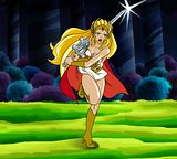


Looks good, seems you are steadily improving; some points:
·Could use some more shading
·Make the colours softer
-like this:
-if you still want to use those hard colours, get rid of those really sharp highlights; like this:
·Compared to her knee, her left foot seems to be turned left a bit too much
·The sword seems to be going through her hair, that's just odd; the sword should be pushing the hair aside.
The next 2 points are just to make the overall presentation better:
·The bg just clashes too much
·Her shadow just comes across as lazy
You haven't had a reply in a long time, so I hope these points help you.
The colours were taken directly from an animation cel, so the colours are as is (same with the BG), though the shading is the least I have ever put on a figure, I can do something about the foot, that's no problem. Lastly, the shadow was lazy, it was 9:44am and I had been working through the night... I was tired and just wanted to finish!
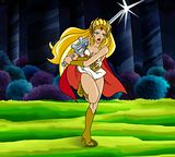
*EDIT*
Ignore the ground shadow, I'll redo that when I can be bothered, as it's not really that important, but is this a little better:
Last edited by Zentron; Sun, 01-08-2012 at 04:25 PM.
 Posting Permissions


 Reply With Quote


